The Creating Accessible Content guide covers the general principles of creating universally accessible content published on the web. It highlights techniques to address specific limitations or the use of assistive technologies, such as screen readers for people with visual impairment or sign language for those with auditory limitations. Finally, it gives specific tips on creating different galley formats in an accessible way.
This guide will be useful for authors in preparation of their manuscripts and for editors in formatting materials for publication and adding content to journal websites.
Copyright: Simon Fraser University holds the copyright for work produced by the Public Knowledge Project and has placed its documentation under a Creative Commons Attribution 4.0 International License.
Accessible and inclusive publishing
Online publishing grants publishers an unprecedented opportunity to reach readers around the globe. Accessible and inclusive publishing principles further ensures that online content is free of barriers for the broadest audience possible, regardless of their age, ability or disability.
The Web Content Accessibility Guidelines (WCAG) provide an international set of guidelines that are used as a basis for this guide. Additional national and international laws and standards exist. Depending on your jurisdiction, accessibility may be a legal obligation for your journal or institution.
Who benefits from accessible content? #
Your audience may include a wide diversity of people and abilities. Some of these abilities can impact how people access and read your journal online. Consider limitations such as visual, auditory, speech, physical, cognitive, neurological, or their combination and how they may affect people perceiving your content.
Barrier-free content is crucial for people with disabilities, but its benefits extend to the larger audience. For example, providing alternative text for images benefits anyone who does not have access to graphics. Adding captions to a video makes it watchable by those in sound sensitive environments, such as a library or a noisy space.
These principles lie at the core of Universal Design. Universal Design benefits all ages and abilities and recognizes the diversity and different requirements of users.
In this guide we cover the general principles of creating universally accessible content. We also highlight techniques to address specific limitations or the use of assistive technologies, such as screen readers for people with visual impairment or sign language for those with auditory limitations.
Website accessibility vs content accessibility #
When it comes to online journals, two aspects of accessibility need to be addressed:
- Website or platform accessibility, i.e. accessibility of OJS itself. This ensures that readers, authors and editors can navigate OJS regardless of any impairments or assistive technologies they use. PKP is working on bringing OJS structure and themes up to the current web accessibility standards – for the status of that work or to contribute see this update on the PKP website. Additionally, if you modify your journal’s theme yourself, make sure to follow the guidelines outlined in the Inclusive and Accessible Theming chapter of the Designing Your Journal Guide.
- Content accessibility, covered in this guide. Specifically, it applies to:
- Website content, such as information you add when filling out OJS form fields, creating static pages, announcements, etc. It is usually created by the Journal Manager or the person responsible for website content.
- Published content, including journal articles and other materials that are uploaded as galleys. Some of the principles below will need to be applied by copyeditors and production editors, others will need to be communicated by editors to the authors.
In addition to following the standards and best practices outlined below, we recommend that you add a notice on your journal website directing readers to contact you about accessibility concerns or issues that need to be addressed.
General principles for creating accessible content
Alt text for images #
Alt text (“alternative text”) is a machine-readable tag that describes an image in words if the image cannot be displayed for any reason, including slow internet connection, error in the HTML code, or the use of assistive technology.
Where to add alt text #
- Not all images need alt text. If an image is informative versus decorative, it will need alt text that also gives context to the image.
- Examples of images that are considered informative:
- Images that are links or buttons
- Clickable images should have alt text or be part of a clickable area that includes a description or context of the image. It should give clues on what will happen when clicking the link
- If there is no text around the image, it needs alt text.
- Images that contain important text
- Logos
- The alt text for a company or organisation’s logo in the header should be the company or organisation’s name. Add additional alt text for a link destination, for example, the UserTesting logo could have the alt text “User Testing – Home”.
- The description of an image can also be found at the bottom of the image as a “caption”.
- Logos
- Images that are links or buttons
- Examples of images that are considered decorative:
- Used for aesthetic purposes (visual enhancements, decorations, embellishments)
- Provide no information
- Have no function beyond aesthetics
How to write alt text for images #
- The recommended number of characters for alt text is 125 characters or less for compatibility with popular screen readers.
- All alt text should end with a “.” so that the screen reader will pause after reading.
- Issue and article cover images should have alt text.
- Image clues to write about in alt text:
- The placement of objects in the image
- Image style (e.g. painting, graph)
- Colours
- Names of people in the image
- Clothes, if they are important details
- Animals
- The placement of text within the image
- Emotions (e.g. smiling)
- Surroundings
- Image descriptions that can be left out:
- Description of colours
- Obvious details, such as a person has two eyes, a nose, and a mouth
- Details that are not the focus of the image
- Overly poetic and detailed descriptions
- Emojis
Icons #
- Icons follow the same principles; are they informative or decorative?
- Is there text directly next to the icon?
- If there is text, does it describe what the icon is for?
- If the icon is a link or a button, what happens when it is clicked or activated? Where does it go?
Complex images #
- Complex images contain substantial information, for example:
- Graphs or charts (e.g. flow charts, organizational charts)
- Illustrations or diagrams
- Maps or other geographical or topographical images
- The recommended alternative to writing about complex images is to write both a short and long description:
- The short description in alt text first identifies the image, and then indicates the location of the long description. E.g.
alt="Graph of quarterly temperature changes. Discussion available below.". - The long description on the page contains essential information that is conveyed by the image.
- The short description in alt text first identifies the image, and then indicates the location of the long description. E.g.
Image positioning for screen readers #
Image positioning matters for text documents (e.g. Word, PDF) when read by screen readers.
Only images with the Wrap Text style of “In Line with Text” are recognized by screen reader software. When exported to PDF, images with other wrapping styles will be skipped by a screen reader even when an alt tag is present.
Video and audio content #
When creating video and audio content, it is important to ensure that it is accessible to users with visual, auditory, and neurological disabilities. Make sure that the video does not play automatically, as people should be able to choose when to play the content. A hearing impaired person may not be aware of the audio volume; users with physical or cognitive disabilities may not be as fast to stop the video and may impact other people in their environment, as well as feel embarrassed by the situation.
Video and audio quality #
- Ensure that the video contains no unannounced flashing/strobing that could trigger seizures due to photosensitivity;
- Provide high-quality foreground audio that is clearly distinguishable from any background noise to aid people who are hard of hearing.
Providing alternatives for video and audio #
- Captions. Captions are text alternatives to the spoken word presented within multimedia. They are beneficial to those who cannot hear the audio, those who may not be fluent in the language or those who prefer to receive information via text over sound.You can have automated captions generated that will then need to be reviewed and corrected by a human reader, using tools like:
- Transcripts. Transcripts contain the full text of the spoken word (not necessarily verbatim) that could be accessed and read separately from the multimedia itself. Transcripts allow deaf/blind users to get content through the use of refreshable Braille devices. They are also useful for searching and navigating to a specific part of the text.When planning a video/audio recording, it is a good idea to have the transcript written out ahead of time. It can then be used both for the multimedia creation and to be made available afterwards.
- Audio descriptions. Audio descriptions are meant to provide additional information about content that is visible on the screen for users with visual disabilities. They typically take the form of a narrator that describes visual-only content in the multimedia and can be provided with the primary video, or in another audio track.When producing a video, the need for audio descriptions can often be avoided by describing or presenting the visual content via spoken audio. For example instead of saying “click here and then here”, you can say “click File and then Save” thus conveying visual content through audio.
- Sign language interpretation. While closed captions or transcripts provide a suitable alternative for users with hearing disabilities who are comfortable reading written language, they may not be sufficient for deaf users who rely on sign language as their primary (or only) language of communication. In this case an alternative can be provided via sign language interpretation or other tools outlined in the Accessibility for Sign Language users section.
Accessible hyperlinks #
Users who navigate using a screen reader must be able to unambiguously understand the purpose of the link and skip links they are not interested in. To achieve this, link text needs to be:
- Descriptive. When writing URL text, make sure it can be understood without additional context. E.g.:
- Do not use: “Click here to read about OJS”.
- Use instead: “More information is available on the Open Journal Systems (OJS) page”.
- Concise. Use keyword(s) as linked text rather than longer sentences. For text that is meant to be printed, hyperlink the text and add a full URL. E.g.:
- For online display: “More information is available on the Open Journal Systems (OJS) page”.
- For print display or online + print: “More information is available on the Open Journal Systems (OJS) page at https://pkp.sfu.ca/ojs/”.
- Unique. Avoid similarly named hyperlinks if they link to different places.
- Visually distinct. Use the default blue underlined style for hyperlinks. If you change it, make sure the links are still high contrast and underlined. Don’t use underline for non-hyperlinked text.
Contrast and colour reliance #
Contrast and colour use are vital to accessibility. Having insufficient contrast may affect users with visual disabilities. Having content that relies on colour to convey meaning may affect users with colour vision deficiencies (CVD) and those who rely on screen readers.
Contrast ratio #
Text colour against the background may appear as sufficiently distinct to a sighted reader, but may present issues to a reader with visual disabilities. To help evaluate it, WCAG 2.1 Guidelinesquantify accessible contrast ratio as at least 4.5:1 for normal text and 3:1 for large text, for Level AA.
You can use WebAim’s Contrast Checker, Contrast Ratio Checker, or the Colour Contrast Analyserto check the contrast ratio between your website’s background and text colours. Here is an example of a check done using WebAim’s Contrast Checker:
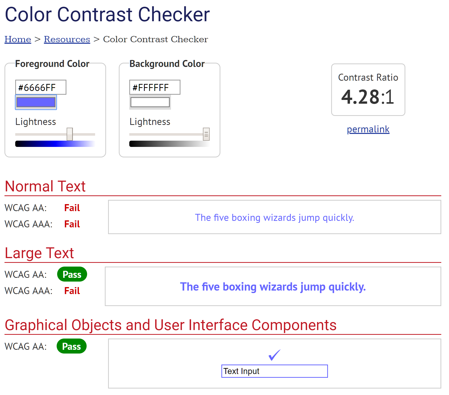
Example of WebAim’s Colour Contrast Checker interface options
In this example, normal text of purple colour #666FF is not sufficiently distinct against the white background #FFFFFF and fails the Level AA standard, but large text of the same colour passes. To fix the issue, you can darken the text colour or increase the font size.
Similarly, you can use the WebAIM Link Contrast Checker to evaluate the visibility of your links.
Use of colour #
We often use colour in web content or in published content to convey meaning. Using coloured graphs or illustration is one such example. When making the choice to use colour, consider whether a reader with colour vision deficiencies (CVD) or using a screen reader would still be able to understand the meaning conveyed. It is essential for the colour to not be the only means of conveying the information – consider adding other textual queues (e.g. numbers or % on a graph).
Don’t do this:

Do this:

Other tools, such as the Spectrum Chrome extension allow you to emulate different types of CVD on any website. This is particularly useful if your articles contain data visualisations. The following two figures, obtained from an article published in the journal Polar Research, illustrate how CVD can affect a user’s understanding of a graph or a chart.
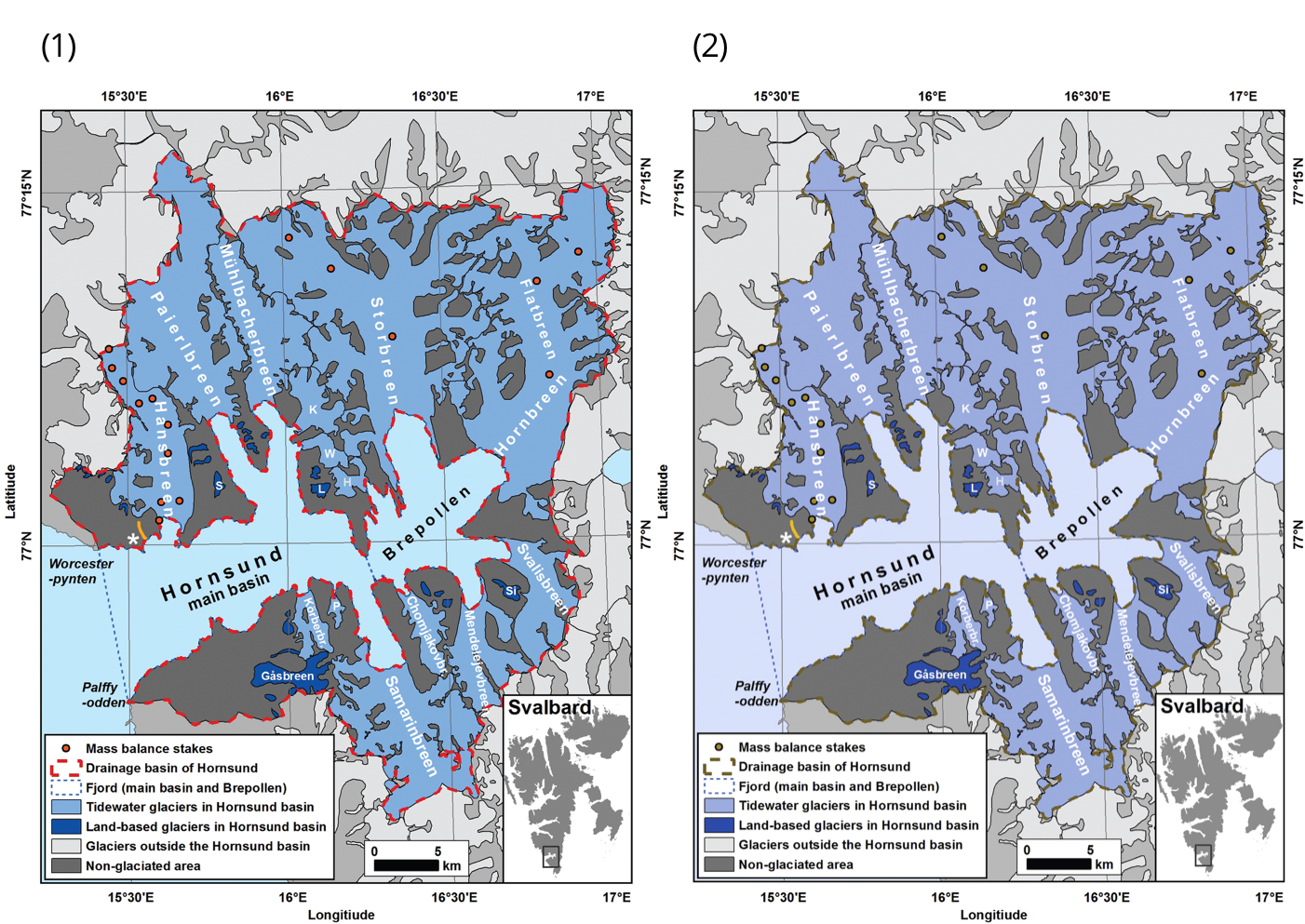
In this figure, the original (1) is still accessible and legible to users with deuteranopia, a green blindness, as shown in (2).
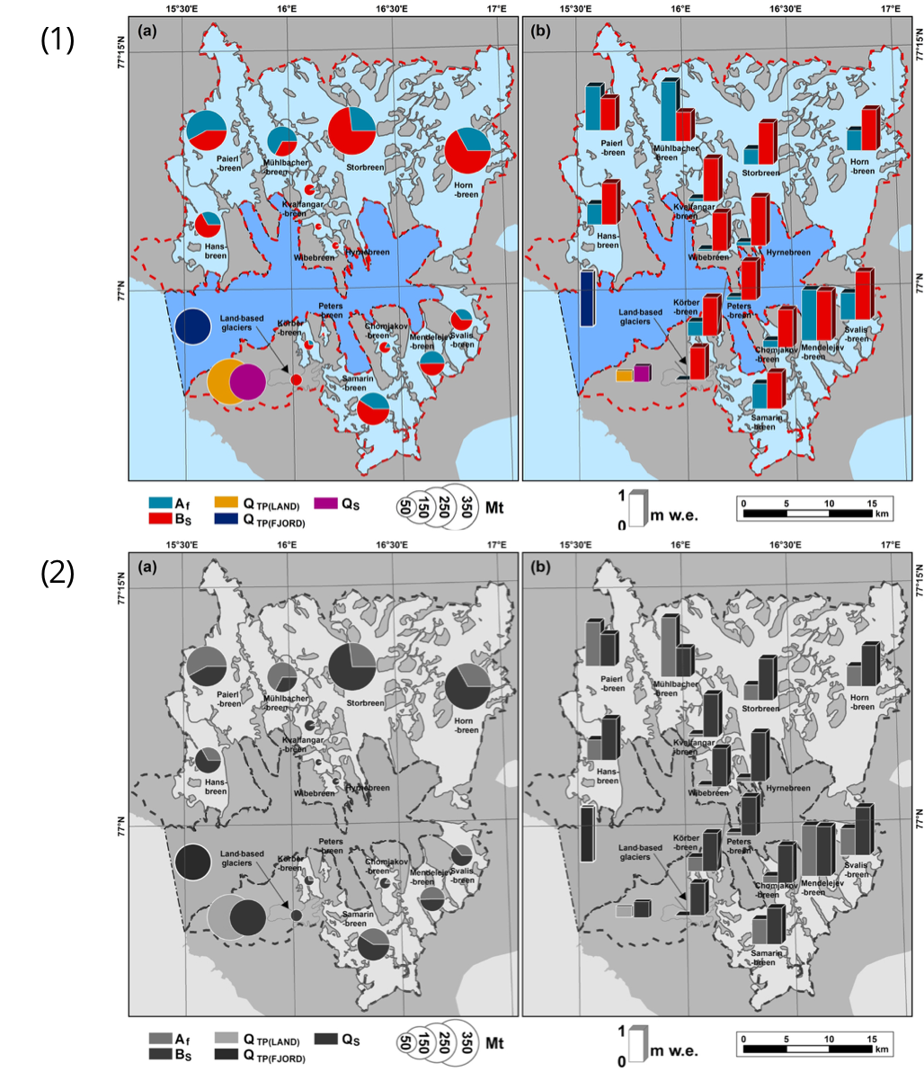
In this figure, the original’s (1) colour legend is not as clear for users with achromatopsia, total colour blindness, as shown in (2). Some of the data’s categories are too similar to each other.
Certain web-based tools like ColorBrewer provide accessible colour palettes for data visualisation, adapted to different types of datasets (sequential, diverging, qualitative). When in doubt, you may also fall back on different shapes or patterns to indicate delimitations in large groups of data points.
Readability and legibility of writing #
Understandably, text writing and formatting for a journal will likely follow conventions of a particular scholarly community. But there are general principles we can follow to make it more readable and legible.
Start by ensuring the text is free from spelling and grammar errors. You can use the built-in spell check in MS Word or Google Docs or free online tools such as GrammarCheck.
Shorter paragraphs will make the text easier to read on small screens and will help people with cognitive, neurological and/or learning disabilities. Similarly, expanding acronyms and abbreviations on first use and keeping a list of acronyms as an appendix for reference is a common and helpful practice.
WebAim’s Writing Clearly and Simply guide contains other helpful tips for writers to achieve clarity and simplicity. Additionally, tools like Hemingway App can help evaluate your text for complexity and suggest ways of improving its general readability.
Headings structure #
Headings help users understand how the content of a page is organized. Also, they provide in-page navigation which is used by web browsers, plug-ins, and assistive technologies. When creating web content, using heading hierarchy in rank order will help users navigate the document with more ease.
Headings can provide a clearer idea about the content once it shows an outline of it. For that reason, rather than write a long main heading, it is advised to use subheadings.
It is possible to create content sections using subheadings, and these can connect related paragraphs.
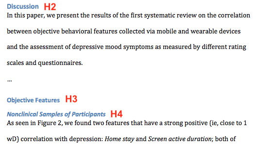
Example of heading formatting for JMIR papers from JMIR Publications Knowledge Base and Help Center.
HTML documents #
In accessible HTML documents, headings are structured using the following tags: <h1>, <h2>, <h3>, <h4>, <h5>, and <h6>. They are nested according to their rank or level. Rank level is defined by the number of heading tags. Hence, <h1> is the highest level in importance and <h6>is the lowest subheading in the structure rank of headings.
Avoid skipping headings in a document structure to prevent confusion, even if you prefer the visual presentation. A <h2> must be followed by a <h3> as the next subheading in the same section. However, it is fine that a <h4> is followed directly by a <h2> when it opens a new section, as long as <h4> closes the previous one.
Only one <h1> heading should be used per document, because it is the document title or article title.
Examples #
The example below shows an article structure with headings where the Article title is the highest rank heading and the most important info of the structure.
(h1) Article title
(h2) Abstract
(h2) Introduction
(h3) Background
(h2) Methods
(h2) Conclusion
The example below demonstrates how to nest sections, with the lowest level closing the previous section. In this example, the “(h4) Background by region” closes the “(h2) Introduction” section and is fine in accessibility terms.
(h1) Article title
(h2) Abstract
(h2) Introduction
(h3) Background
(h4) Background by region
(h2) Methods
(h2) Conclusion
Text documents #
There are many Text Editors available to create documents, including Microsoft Word, Apple Pages, LibreOffice, and online editors like Google Docs. You can use any editor you like to create documents with accessible heading structures.
Other editors will typically follow the same concept of heading ranking and nesting. You will usually have the option to select a portion of text and format it as a heading.
The following image shows the heading options for Google Docs:
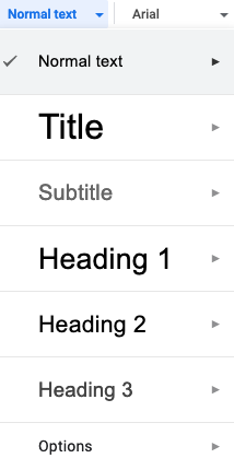
The heading hierarchy for documents on text editors should follow the same concept of rank level for HTML documents:
- Every document must have a Heading 1
- Do not skip heading levels, e.g.: a Heading 2 must be followed by a Heading 3 then Heading 4, except when starting a new section
- Headings should be unique to prevent any confusion while navigating, skimming or reading the whole document
Lists #
According to the content presented and how the content creator wants to organize it, there are three types of lists for web content. The type of list used depends on the kind of information that is being organized and its purpose.
- unordered list
- ordered list
- description list
Assistive technologies inform users what type of list will be read before proceeding to each item. It also describes how many items are on a list, the current item, and how many list items are still remaining.
Unordered list #
In an unordered list, the elements order is not important and is used to show a group or a set of elements. This list usually shows a bullet for each element.
This list is coded using <ul> for the main element and <li> for each item. Example:
Code
<ul>
	<li>Researchers</li>
	<li>Students</li>
	<li>Editors</li>
	<li>Authors</li>
</ul>
Rendered
- Researchers
- Students
- Editors
- Authors
Ordered list #
The main purpose is to show a hierarchy or sequential information. It can also show steps of instruction to follow or proceedings. It can show a number or a letter for each element listed.
This list is coded using <ol> for the main element and <li> for each item. Example:
Code
<ol>
	<li>Accept submission</li>
	<li>Assign reviewers</li>
	<li>Send to review</li>
	<li>Set a due date</li>
</ol>
Rendered
- Accept submission
- Assign reviewers
- Send to review
- Set a due date
Description list (definition list) #
A description list consists of grouping terms and their descriptions. It is possible to associate one or more terms to one or more descriptions of the terms. The markup for description lists includes the <dl> tag for the start of the list, the <dt> tag for the term(s), and the <dd> tag for the description(s). A term can be grouped to more than one description. Likewise, one or more terms can be grouped with one description. Many terms to many descriptions is also acceptable.
Screen readers will announce the number of terms as well as the descriptions. Below are some examples for description lists:
One term, multiple descriptions:
<dl>
	<dt>Authors</dt>
    	<dd>John</dd>
    	<dd>Kevin</dd>
    	<dd>Juan</dd>
	<dt>Editor</dt>
		<dd>James</dd>
</dl>
Rendered
- Authors
- John
- Kevin
- Juan
- Editor
- James
Multiple terms, one description:
<dl>
	<dt>OJS</dt>
	<dt>OMP</dt>
		<dd>Publishing software platforms developed by PKP.</dd>
</dl>
Rendered
- OJS
- OMP
- Publishing software platforms developed by PKP.
Multiple terms, multiple descriptions:
<dl>
    <dt>Authors</dt>
    <dt>Editors</dt>
        <dd>James</dd>
        <dd>Michael</dd>
</dl>
Rendered
- Authors
- Editors
- James
- Michael
Columns #
While newer screen readers are typically compatible with multi-column layout, some older screen readers may read the page left-to-right, line by line, rendering the text out of order.
Tables are frequently used to create column formatting, but this is a common misuse. Tables (as detailed below) should be used exclusively for tabular data or content. Screen readers are expected to announce this as a “Table” and interpret the first row of a Table as the Table Header, causing potential confusion.
If you determine that columns are the best way to present your web content, the preferred way is to use CSS to format multiple columns. However, it is important to ensure that the text is ordered coherently, even when CSS is inactive.
For text documents (e.g. Word, PDF) it is important to create columns using the Columns formatting tool rather than by using the tab key or spacebar to create whitespace between lines of text.
Tables #
Tables should be used exclusively to present tabular data or content. Tables can help organize content with a logical relationship in grids, making it easier to read and understand. For more on accessibility in tables see the W3C/WAI Tables Concepts page.
It is possible to use tables to position elements visually in a document or page, although it is not advisable. It can cause confusion for assistive technologies that would announce the element as a “table” where it may in fact contain different content. It may give a sense of missing data in the wrapping element.
Table structure #
Different types of data or content can be presented in a different structure of tables. The complete structure set of this element involves:
- Caption/Summary: or table title, it could be either a short or long description of the data in the table, i.e.: “How I choose to spend my money”. It serves to describe the content that the user will read and find in the table.
- Table header: Usually the first row of a table. It provides a label to the column and what type of information to expect in that column. However, for long tables it is also possible to use the whole first column as a table header as well. For example, tables containing countries and social indicators usually have the first row and the first column as table headers.
- Table body: wraps the main content or data of a table. It presents them below the table header and above the table footer.
- Table footer: this element serves to summarize the columns of a table. It is useful for tables values or numerical data. It is not a mandatory element for tables with values that do not require a summary, i.e.: table with names, ages, citizenship, etc. That is to say, even if age is a numerical value, it should not be summarized at the bottom of a table.
Below is an example of a table with elements of a table described above: Caption, Header, Bodyand Footer.
| Purchase | Location | Date | Evaluation | Cost (€) |
|---|---|---|---|---|
| Haircut | Hairdresser | 12/09 | Great idea | 30 |
| Lasagna | Restaurant | 12/09 | Regrets | 18 |
| Shoes | Shoeshop | 13/09 | Big regrets | 65 |
| Toothpaste | Supermarket | 13/09 | Good | 5 |
| SUM | 118 | |||
Table example with: Caption, Header, Body and Footer (summarizing) – Source: https://developer.mozilla.org/en-US/docs/Learn/HTML/Tables/Advanced
For HTML documents the following tags are used to define a table main structure: <table>, <thead>, <tbody> and <tfoot>. The last 3 elements are always wrapped by the <table> tag. You can find further technical info about how to generate HTML tables for visually impaired users on the Mozilla web docs.
To create accessible tables in Microsoft Word:
- Ensure that “Header Row” and “First Column” are designated (checkbox checked)
- Repeat column headings where a table spans multiple pages
- Add alt text in table properties
- Choose table design that meets WCAG contrast requirements
Document metadata #
Adding metadata to your document increases its searchability. It also allows software applications and adaptive technologies to give the users the key information about the document, so they can easily find the desired document and determine if it is what they need. To learn more, see the Better Practices in Journal Metadata guide.
Filename #
- Screen readers read the filename when navigating to a document from another document. Making the file name identifiable and meaningful will help both screen reader users and anyone who saves the file locally for future reference
- Avoid special characters in filenames
- Words separated by hyphens “-“ and by capital letters (e.g. dogShow) may be read as individual words depending on the screen reader
- Galley files should follow a common naming pattern that would be consistent across all publications
Title, author, and more #
To add or modify the title, author, or subject of an MS Office document, navigate to:
- Windows: File > Info > Properties
- Mac: File > Properties > Summary
Adding the following information in MS Word should be transferred to the PDF on conversion:
- “Title”, which corresponds to “Document Title” in the PDF file
- “Subject”, which corresponds to “Description” in the PDF file
- “Author”, which corresponds to “Author” in the PDF file
- “Tags”, which corresponds to “Keywords” in the PDF file
Note on using capitalization in titles
If your discipline often displays article titles in all caps, you may want to avoid entering the titles in all caps manually, as screen readers may read this as an acronym rather than a title. Instead, the title and subtitle should be entered with upper and lower-case characters, e.g. “The Trolley Problem of Climate Change”, and then made upper-case through your journal’s stylesheet. This will also ensure the title is made available in its original form for downstream indexers like Crossref and Google Scholar.
Language #
A screen reader that supports multiple languages will rely on the web pages’ language tag to know in which language to read it. If you use OJS with multiple languages, make sure to use the proper language locale for that language (e.g. French locale for the French language) as the locale determines the language tag for the page.
Additionally, if you publish galleys in PDF, you can set the language tag for the document as follows:
- Open the Document Properties dialog: Choose File > Properties
- Select a language from the Language menu in the Reading Options area of the Advanced tab.
If you publish galleys in HTML or XML, it is best practice to set the lang, global language attribute, to the root element of each document. This declares the language of the entire galley, and helps assistive technologies determine how to pronounce words. It also helps search engines and web browsers.
You can also add the language attribute to specific elements, when the language changes mid-document. For example, an English language document may quote a paragraph in French.
In HTML:
<p lang="fr">Ceci est un paragraphe.</p>
In XML:
<section id="test" xml:lang="fr">
	<title>En Français</title>
	<p>Ceci est un paragraphe.</p>
</section>
Accessibility for Sign language users #
For some people with auditory disabilities, sign language may be the primary language, and they may not read the written language fluently or at all. Here are some of the strategies to make your content accessible to them:
- Present information via a video accompanied by sign language interpretation – see for example Revista Brasileira de Vídeo-Registros em Libras
- Add automated sign language interpretation by a virtual sign language avatar to the website – see for example VLibras for the Portuguese Sign Language Libras
- Use simpler text that is supplemented by images, graphs, and other illustrations
Use signwriting where available for the sign language of your country. For further resources see the Sutton’s SignWriting site.
Creating accessible galley files
This section provides an overview of how to incorporate the accessible content principles listed above into specific galley formats your journal may be using.
How to check an MS Word document for accessibility #
The MS Word Accessibility Checker scans the file for common issues that may make a file less accessible for users with disabilities.
Run the Accessibility Checker:
- Windows: File > Check for Issues > Check Accessibility
- Mac: Review > “Check Accessibility”
After running the Checker, the “Inspection Results” will display one or more of the following messages:
- Error: identifies content that makes a document difficult to read and understand
- Warning: identifies content that in most cases, makes the document difficult to understand
- Tip: identifies content that may not constitute an end user issue, but could be presented in a different way to optimize user experience
Clicking an item in the “Inspection Results” list will take you directly to the issue – the item will be removed from the inspection results automatically once it is addressed. You do not need to re-run the checker.
For further support, see the MS Support resource Improve Accessibility with the Accessibility Checker.
Labeling your galley files #
Galleys should be labeled according to the type of file being published, such as PDF or HTML (see below for information on choosing which galley formats to use). Your galley files should also follow a common naming pattern and be consistent across all publications, so that all galleys of the same type (e.g. PDF) have the same label. Screen readers will read out the type followed by the title, like “PDF: Open badges as credentials in Open Education systems: Case studies from Greece and Europe”.
Supplementary galleys should have a label that describes the content. For example, “Supplemental Data” is not very descriptive. “Regional Income Data” or “Interview Transcripts” are more descriptive.
Which galley formats to use? #
Online journals publish their articles in a variety of file types. The most common are PDF and HTML, but increasingly these additional formats are being used: ePub, MP3, and XML. As a general rule, more structured formats (those with tagging in place to indicate the features, such as headings, alt text, etc) are the most accessible. With all formats there are things you can do to maximize the accessibility and preserve the structure of the original document.
PDF #
PDF is the most common format for publishing articles, but can present a number of issues from an accessibility standpoint. One of the main issues is that a text document created with accessibility considerations in mind may lose some of these features when converted to PDF, such as tags, alt text, headings, etc. Here are the steps to follow to minimize these risks:
1 – Ensure the source document is accessible #
Follow the General Principles to create the source document with accessibility in mind. If you are using MS Word, use the Accessibility Checker to validate it.
2 – Convert the document into PDF #
The method you choose to export your Word Document to PDF will affect the preservation of the accessibility features that you have added to your document. For additional guidance see the WebAIM PDF Accessibility Guide – Converting Documents to PDF.
Preferred Method (requires Adobe Acrobat Pro) #
Export your Word Document by using “Create PDF” from a file in Adobe Acrobat Pro. Open Adobe Acrobat Pro > File > Create > PDF from File > Select desired document to convert.
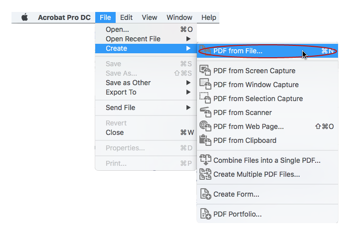
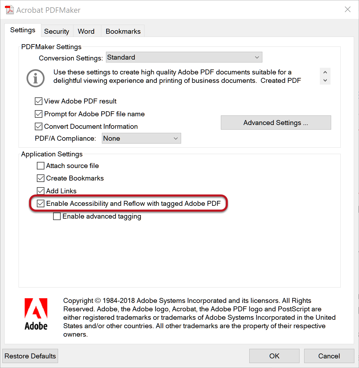
If you are creating a document via the Acrobat Tab in MS Office, make sure that Enable Accessibility and Reflow with tagged Adobe PDF is checked.
Next Best Method (does not require Adobe Acrobat Pro) #
Save your Word Document as a PDF using the “Save As” function. This may not preserve all accessibility features, such as tagging, so it’s best to use Acrobat Pro if you have it.
On Windows: Select File > Save As. Select “PDF” from the list of drop-down files. Click “Options” and make sure “Document structure tags for accessibility” is checked, then save the file.
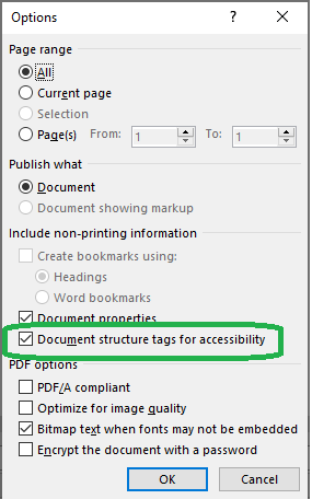
On Mac: Open the File application menu and select Save As… Under File Format, select “PDF”. Then choose the Best for electronic distribution and accessibility (uses Microsoft online service) radio button, then Export.

IMPORTANT: never “Print to PDF” when exporting a Word Document to PDF. A screen reader user may still be able to access the text of a PDF created in this way, but heading structure, alternative text, and any other tag structure will be lost.
3 – Check a PDF document for accessibility #
If you are creating a document from MS Word, start by checking accessibility using the MS Word Accessibility Checker.
After the document has been converted to PDF, it’s a good idea to check that accessibility features are preserved and nothing has been lost. This includes checking that tags are present and the reading order is correct for a screen reader.
This process requires Adobe Acrobat Pro and is described in detail in WebAim’s PDF Accessibility Guide.
4 – Remediate a PDF document #
If you receive a PDF that is untagged, or where the tag structure is incomplete or incorrect, it is usually best to return to the source document, make the necessary accessibility repairs, and then re-create the PDF. If the source document is unavailable, you can use Acrobat to convert a PDF back to a Word, Excel, or PowerPoint file. Select File > Export To, then choose your desired format.
Remediating a document in PDF requires Adobe Acrobat Pro. For more details see the WebAim’s PDF Accessibility Guide.
HTML #
HTML is another popular galley format used by publishers. It offers more flexibility than PDF for adjusting to different screen sizes and accommodating multimedia. It has the potential to be more accessible than PDF as long as the document follows the general principles of creating accessible content, such as structured headings, alt text, etc.
For instructions on how to create and style HTML galleys, add multimedia content, and upload HTML galleys to OJS, see Learning OJS 3: Production and Publication – HTML Files.
XML #
XML files have the potential to be very accessible. They contain extensible markup that divides them into elements (e.g., chapters, paragraphs, tables, lists, footnotes) and have document type definition (DTD) that defines the rules for the document, describes the structural elements and attributes, and tells computer systems (such as assistive technologies) how to interpret the data. XML files can be highly structured and tagged, which provides the opportunity to add context to images, figures, etc. Semantic tagging can improve navigation and logical reading order. For example, semantic tags can tell a screen-reader in which order to read the content.
XML markup is structural and semantic, rather than having anything to do with how the text content should be presented, and the file can be processed automatically to create various formats. Many publishers use an “XML-first” publishing workflow, producing a master XML file that is used to generate HTML, PDF, EPUB, and other formats. This allows publishers to build in all accessibility features at the beginning of their workflow.
For more information on XML publishing in OJS see Learning OJS 3: Production and Publication – XML.
The DAISY Digital Talking Book or DAISY XML is an XML-based e-book format that was developed by the DAISY Consortium as an accessible file format for people with print disabilities. It is a package of digital files that can include digital audio files, marked-up text files, synchronization files, and navigation files. Special DAISY players can play the audio, read the text using Text to Speech, and navigate through the book in an accessible way. This tutorial explains how to make a DAISY Book.
EPUB #
Used commonly in eBook publishing, EPUB defines a means of representing, packaging and encoding structured and semantically enhanced Web content — including HTML5, CSS, SVG, images, and other resources — for distribution in a single-file format.
Below are some resources for accessible EPUB creation:
- Learning OJS 3: Production and Publication – EPUB – how to create EPUB galleys
- EPUB – the DAISY Consortium – EPUB packages and accessibility
- Top tips for creating accessible EPUB 3 files – tips from Diagram Center
- EPUB Validation Process – EPUB accessibility checker
Copyright: Simon Fraser University holds the copyright for work produced by the Public Knowledge Project and has placed its documentation under a Creative Commons Attribution 4.0 International License.

